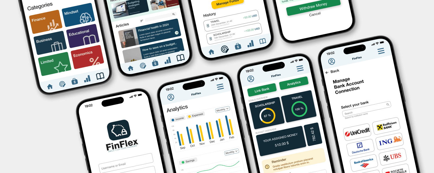
This project is part of my experience with the Google UX Design course. The motivation to bring this project idea to life stems from the lack of budgeting knowledge among people I know, particularly recent graduates starting their first jobs. They often struggle with organizing a monthly budget or evaluating their spending and earnings. To address this, I designed an IOS mobile app, which underwent two rounds of wireframing, prototyping, and testing. After three months, the mobile app is nearly complete.
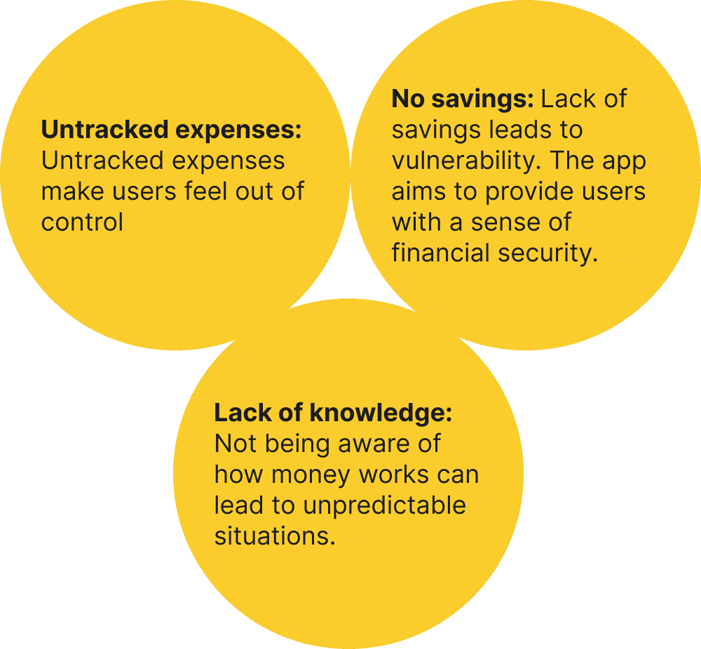
People often find it tough to manage their money, struggling to keep track of expenses, balance their income, and set financial goals. This can lead to overspending, stress, and missed chances to save.
I designed a mobile app that provides various resources about finance, business and budgeting. The mobile app uses Zero-based Budgeting Strategy which offers flexibility to users, so they can overcome challenges and be financially educated.
Concept and Development
Client
N/A
Role
UX/UI Designer
Team
Freelance ( myself )
Year
2024
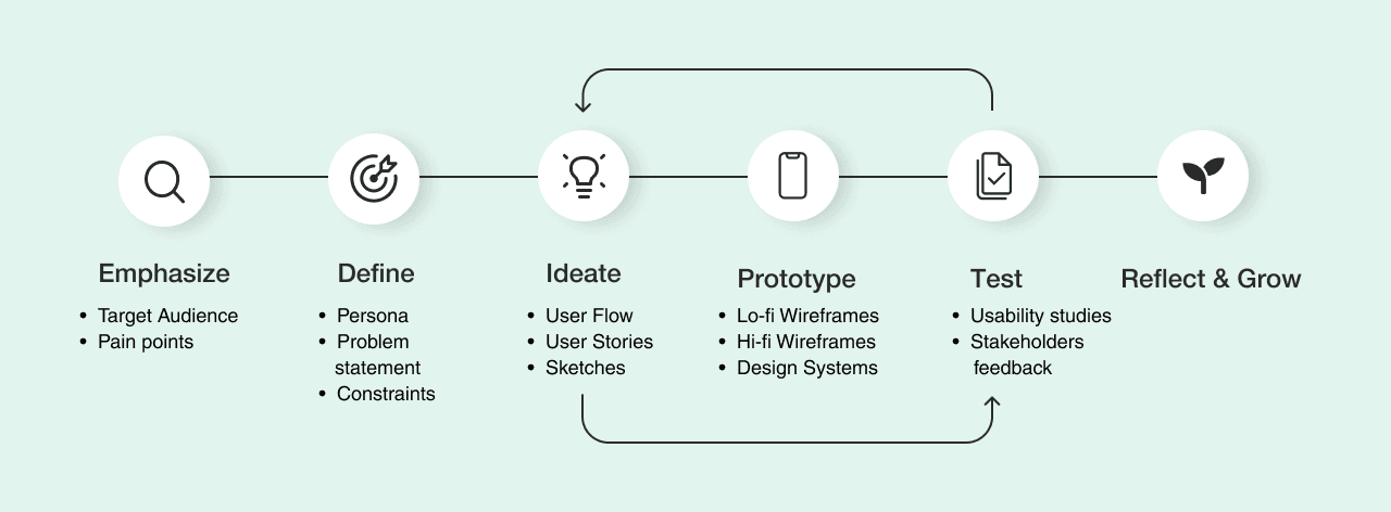
The Design Thinking Process is a user-centered approach to problem-solving that emphasizes creativity, collaboration, and iteration. It focuses on understanding user needs, exploring diverse solutions, and refining ideas through feedback to create practical, innovative outcomes.
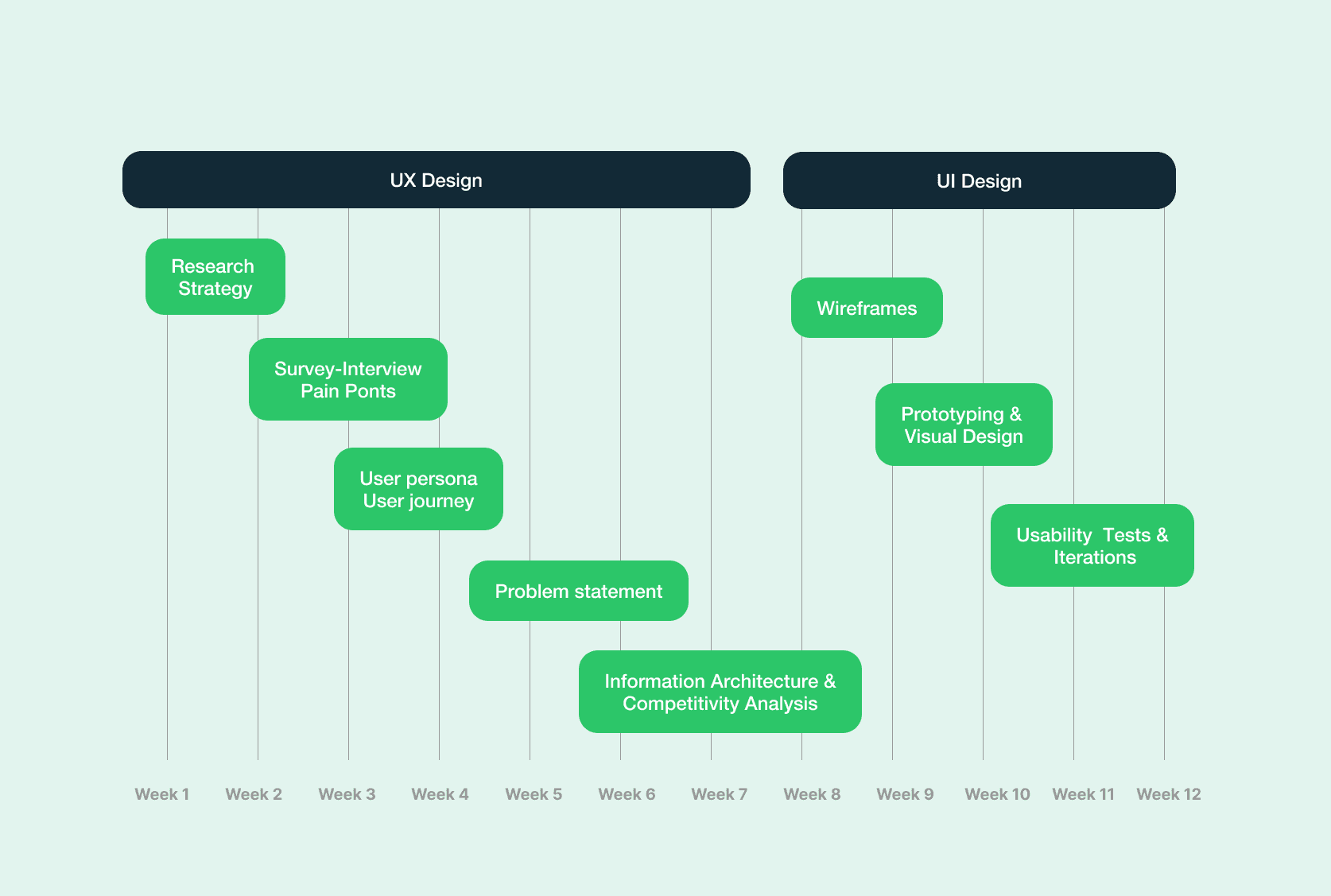
Project Timeline
Empathy Phase: Gathering insights through research
Summary: I conducted unsupervised user research and received feedback from 13 individuals that I incorporated into user persona. I created a survey with open-ended questions that allow users to describe their feelings and needs regarding their financial lives.
Key insights
Most individuals don’t use a specific app for budgeting and finance
There are situations when individuals got financial support from family and friends
There are situations where people access their savings to cover expenses until their next payday
Some individuals try to follow a budget strategy, but don’t own an evidence of their expenses
then identified patterns and pain points based on research
Define Phase: Creating a path for a solution
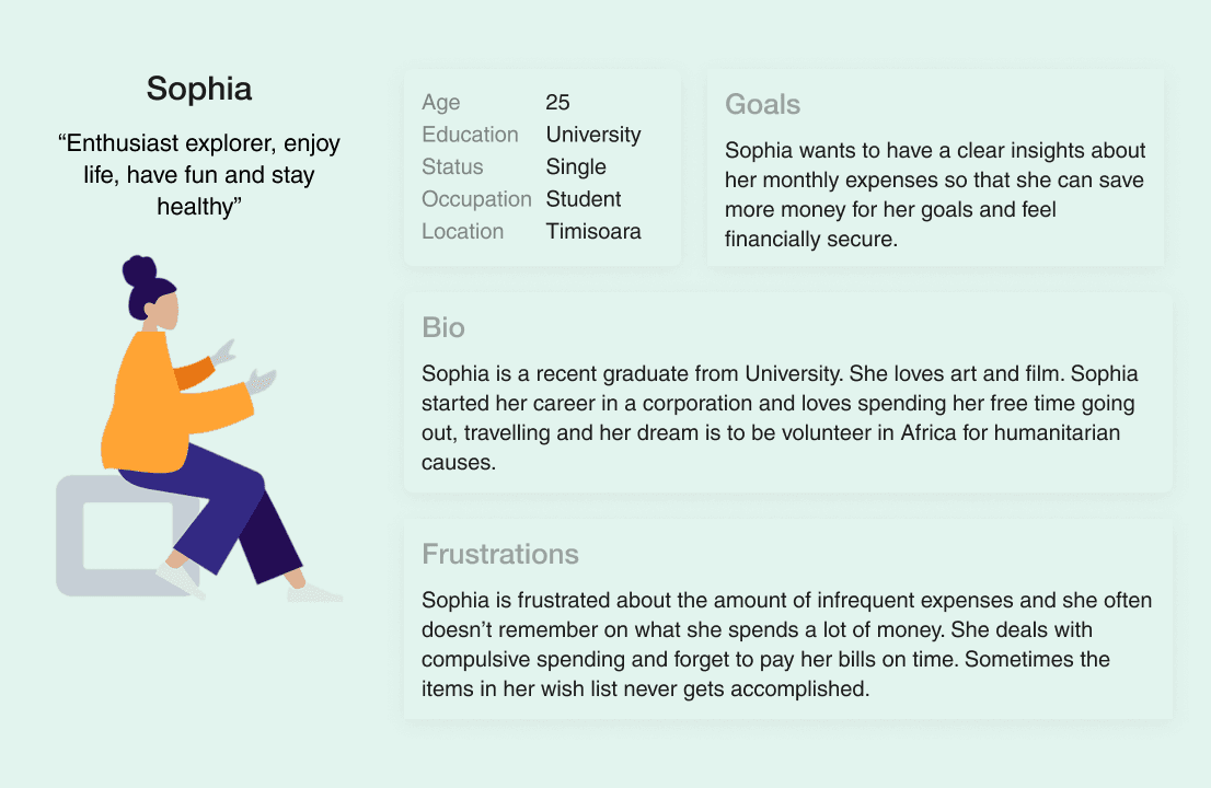
User Persona: Sophie is a user persona—a fictional character based on real research about people like her. Every time you make a design decision, you can ask: Would this work for Sophie? Would it solve her problem or add to her stress?
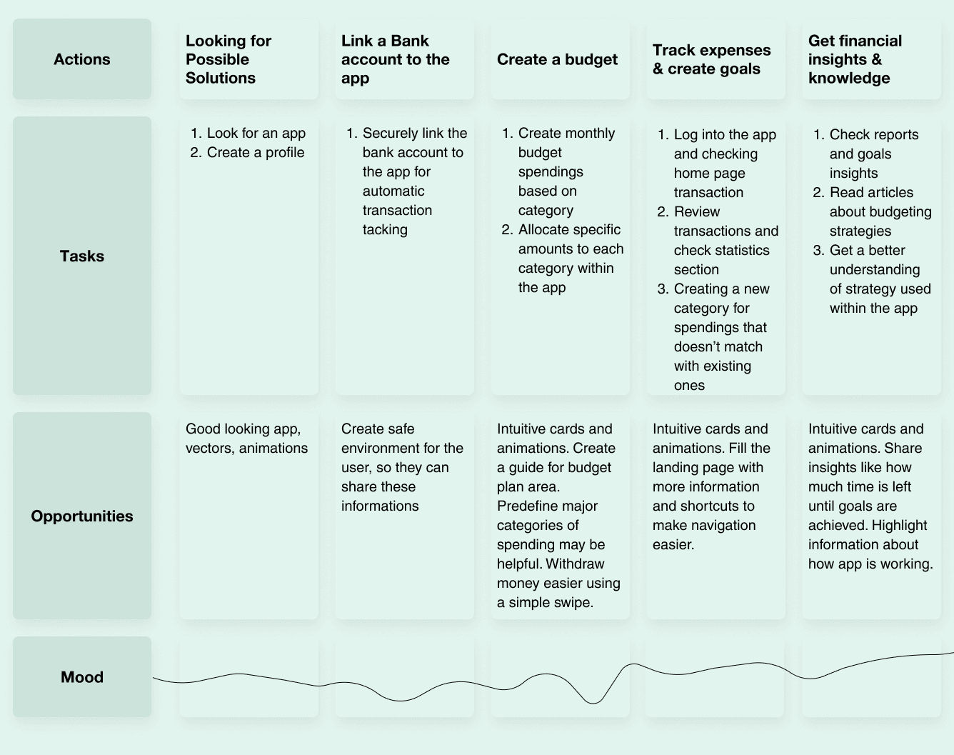
User Journey Map: It’s a visual story of Sophie’s experience with your app, showing every step she takes—from discovering it to achieving her goals. It highlights her actions, emotions, and pain points, helping you design a smoother, more user-focused experience.
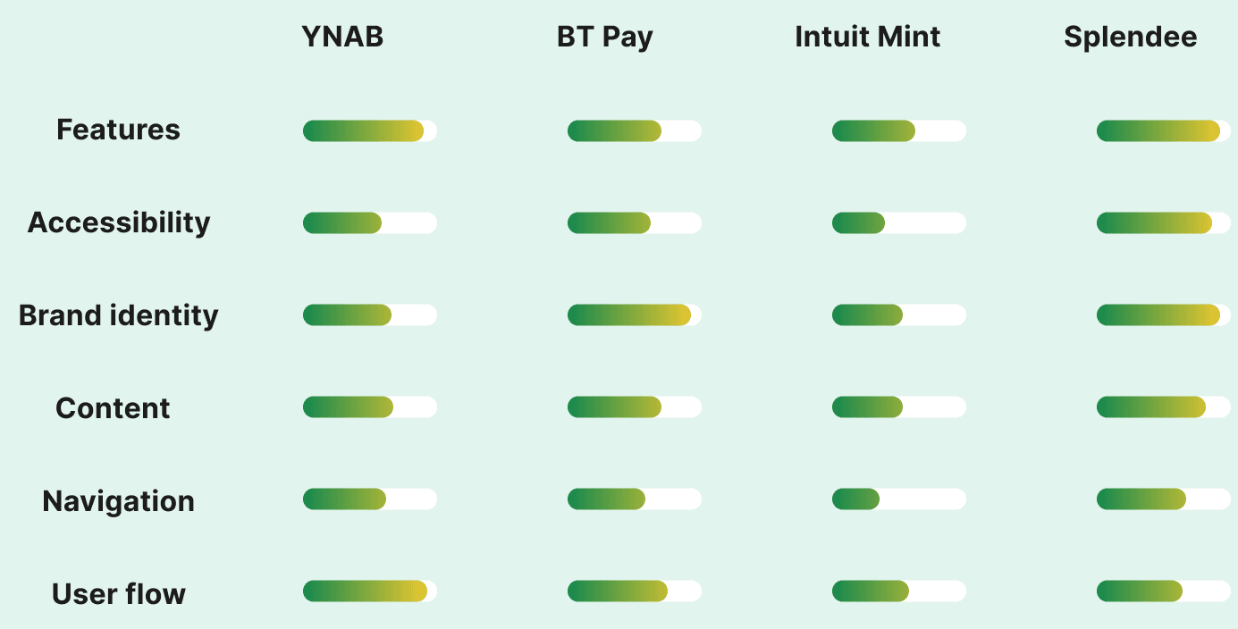
Competitive Analysis: Before Sophie can fully experience the features of a budgeting app, I first reviewed potential competitors offering similar solutions. I examined what they provide and how my solution could stand out and offer unique value.
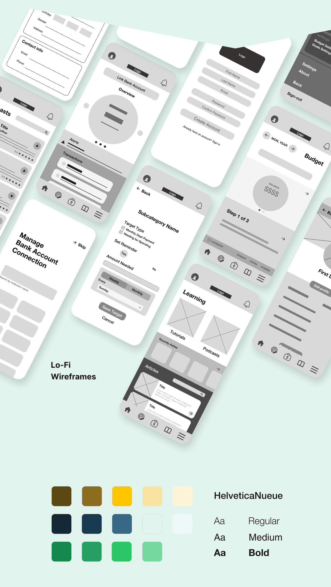
Ideating and Prototyping Phase
Information Architecture
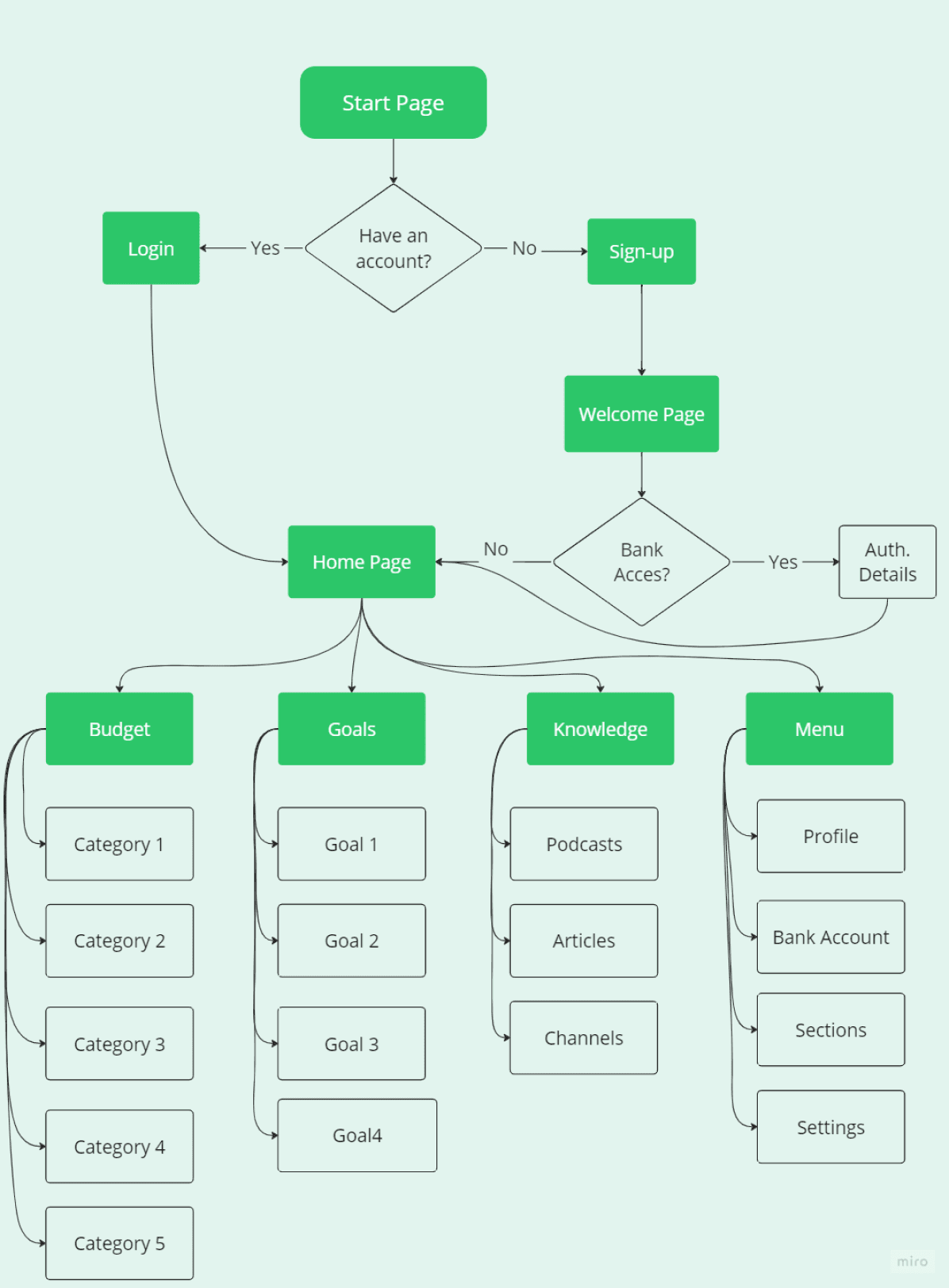
The information architecture offers a well-organized structure to streamline the app’s content and features. It is designed to help users effortlessly navigate, access, and engage with essential elements adapted to their needs. Keep in mind that this structure is a starting point and may evolve as further user research and testing uncover opportunities for refinement.
Testing and Iterations
I conducted an usability study that enabled me to identify pain points in the initial versions of the mockups. The insights and experiences gained from using the prototype were invaluable for identifying areas of improvement, refining features, and enhancing the overall user experience
UX Research Study
Questions:
How long it takes to user to create their full budget?
On average, how many times a week does a user examine their budget?
How would users describe their experience using the monthly budgeting section of the app? What aspects do users find most helpful or challenging?
How much time does it take to user to find the information needed in the Learning section?
How many goals a user can set?
KPIs:
Time on task
Conversion rates
Visual consistency
System Usability Scale
Participants:
Participants are between 18 and 55 years old.
3 male, 2 female
All participants must have an income
Iteration 1: Visual Improvements
In the initial design, users found the CTAs and sections somewhat overwhelming. They also suggested that accessing the menu from the top of the screen is more intuitive. So, I changed the colors to make it look more simple and comfy to watch.
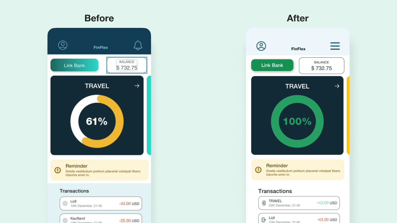
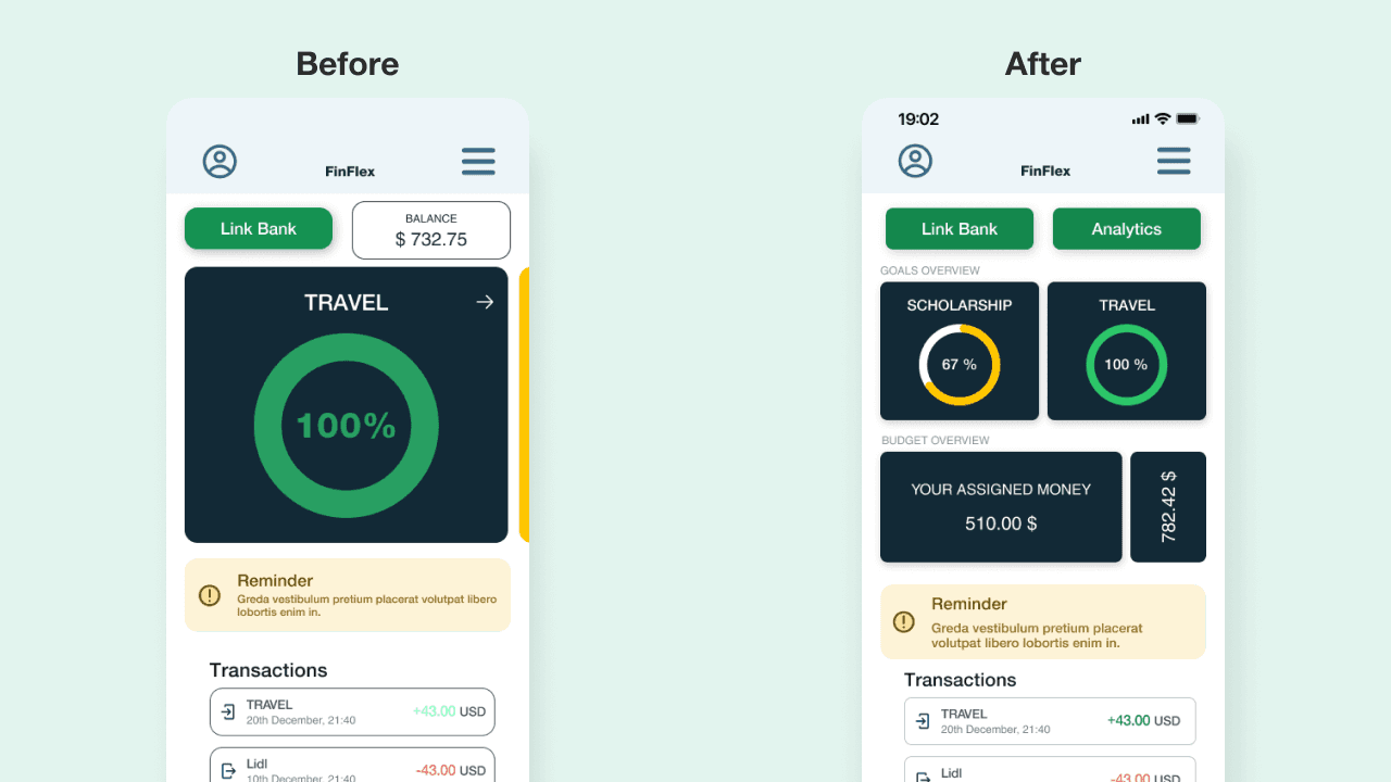
Iteration 2: Get more info directly from the landing screen.
In the first half of the screen, the large goal cards are designed to catch attention. These cards might be slightly confusing to some users - "Is this a budget category or a goal?". To clarify, I created an area with multiple cards and added labels for user guidance.
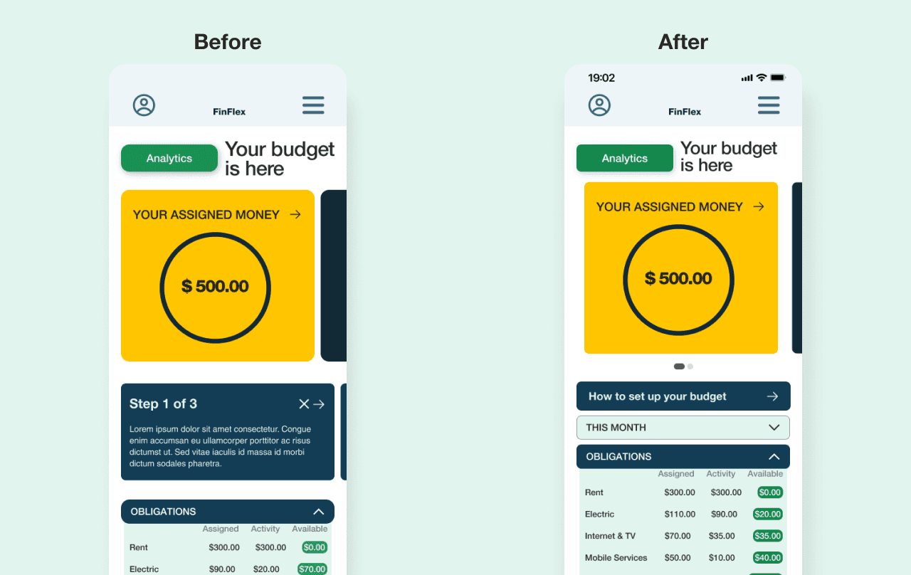
Iteration 3: Access to monthly budget. Keep things simple.
Several users have reported difficulty accessing the budget for the previous month when necessary. Additionally, some mentioned that once they become familiar with the app, they no longer require a guide to create their budget.
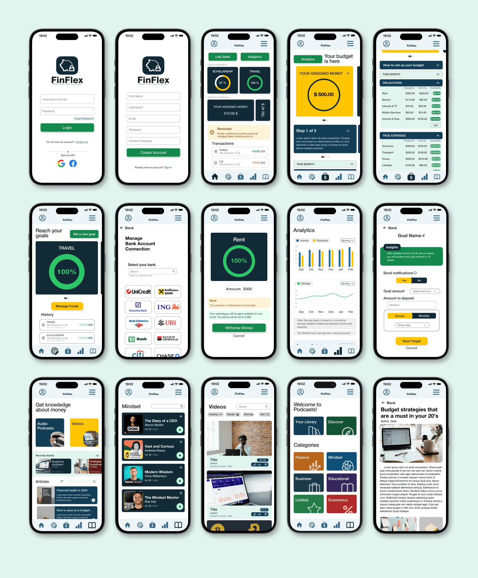
Final Design
Final Thoughts
Accessibility considerations
1. The app is using only one typeface for all headings and paragraphs: Helvetica Nueue. This is a sans-serif font so it is easy for users to read. Mixing too many typefaces can be challenging for users to have a look.
The primary colors used in this project design met WCAG AA Compliance for each screen.
Text hierarchy is visible throughout the app. This helps users to distinguish the different sections and information on screen
What I've learnt…
The importance of collecting user feedback.
Developing empathy towards users while avoiding biases.
Conducting a usability study on a prototype simplified decision-making for a polished design.
Accessibility considerations are essential.
The importance of white spacing for improved design quality